How to Customize UX for Mobile
So what does psychology have to do with it? When it comes to user experience, almost everything.
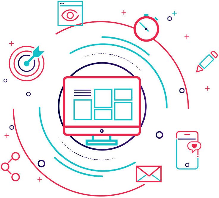
With so many device types and sizes and so many different ways to design websites for those devices, the user experience a designer creates is what determines overall success of the site and whether a user will return.
What is user psychology?
User psychology is the science behind what people want and need when they visit a website or mobile app. Psychology is rooted in everything from whether a user trusts your brand to how they feel about the message you are trying to convey.
And design is a big part of that. Everything from color to images to patterns to how the site works can impact those feelings and emotional connections.
Each of these elements should ultimately lead to an action from the user. Most psychology textbooks reference triggers that cause people to act and react. Those triggers also apply to web design, and even more particularly to mobile design, where a user almost always has to physically interact with a website to make something happen, such as the swipe or tap fingers on the screen.
- Reciprocation: if you do something for users, they will do something for you. (They sign up for a newsletter, you give them a freebie.)
- Framing: users will make comparisons between things. (Do I want this or that? Most users fall somewhere in the middle of all options.)
- Salience: users want what matters now. (That’s why e-commerce websites add related items to the screen during the shopping experience.)
- Social proof: users look to others to see what to do. (The influence of social media.)
- Scarcity: users want what they can’t have. (Limited number of items.)
- Contrast: What stands out in the user’s mind. (Design theory 101.)
Two different user experiences
While the triggers are the same regardless of the device, the user experience is not. Users overwhelmingly want the content to be the same regardless of device, but have different ideas of how to use and interact with that content.
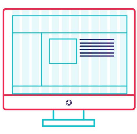
Desktop websites are for reading and perusing. The reading and information gathering process may result in an action, but users often have a distinct reason for going to a website, such as work. Not all of these experiences are based on entertainment or pleasure and most of them may not be.
Desktop users are relatively still in their online interactions as well. Every action is done with a keyboard or mouse. There’s just not a lot of actual physical interaction with the device. (Few users will ever touch the screen.)
The user experience for mobile is significantly different. Users constantly touch the device – casing and screen. So the size of these elements and how they feel are quite important. This use of physical touch makes designing elements on the screen especially important, because they must be easy to touch, unlike desktop versions where the mouse click is always the same size.
Mobile device users often access websites with different intents. Entertainment or task completion activities are more common than reading and research actions. (Just think of how often you pull out your phone to play a game in line at the grocery store or respond to a text message.)
Physical differences also impact the psychology of mobile design. You have to consider lighting conditions, device size and touch options. How will these elements come together for an actual user?
User expectations
It all comes down to a central question: What does the mobile user want and expect?
Unlike with desktop websites, where users expect a visually dynamic and engaging experience that is relatively two-dimensional, mobile users want everything to feel real and live in the three-dimensional space.
Mobile users have come to expect certain things from the interface:
- Every action needs to be tappable. (And easy to see and tap.)
- Graphics and images should load fast, and might not be part of the mobile experience at all.
- Options need to be contextual. Users want to know what’s next and where they can go from here; they don’t need to know every possible option.
- Websites need to integrate with all mobile device functionality, such as mapping, calling and integration with other apps.
- Interactions have to be easy and follow generally accepted patterns. Mobile users have almost zero attention span. If elements don’t work the first time – and without a lot of thought or explanation – the user is lost.
How to design it
The actual secret is combining triggers and user expectations; then design for them. Let’s break down a few examples of sites that do this well and how they combine triggers and mobile expectations for an excellent user experience.
MINT
Mint uses a card-style interface where every box is a clickable element in its mobile app design, whereas the desktop version features more click-style links. Bright color and plenty of white space contribute to the streamlined mobile version as well.
Triggers: Framing and salience are the key triggers here, because as a free service mint is asking you to sign up for limited time offers based on things you likely are thinking about or need, from credit card to insurance offers.
Mobile expectations: Mint loads exceptionally fast with up-to-date user data. The mobile app drops many of the heavier images that appear in the desktop site and uses a simple vertical pattern for the user to …