Within five seconds of landing on your website, can your visitors determine what your company does? Could users easily navigate to the blog if they need to? Is the layout of your pricing easy to understand? Does your website have a low bounce rate?
If you’re finding yourself answering ‘no’ to these questions, it might be time to take a hard look at the way you’ve been designing and optimizing your website.
A website truly excels when it has a design that feeds into your website’s user experience, functionality, and appropriately complements your content.
It can be super easy to neglect these things, thinking these updates are the lowest thing to worry about on your totem pole of website priorities, but a successful website has both high performing content and an exceptional user experience needs to have balance.
The last thing you want is to be spending time writing some amazing content on your blog or service pages, only for it to go unnoticed due to design flaws, navigation issues, or confusing layouts, or missed conversion opportunities.
But the umbrella of website user experience has a lot under it, and it can be challenging to understand all that’s under it while figuring out the most important things to tackle.
So, what do you need to know to start improving your web design?
To answer that, here are 12 website tips to ensure that you’re going in the right direction in your redesign and are assuring you aren’t turning visitors away.
1. Have a plan
Now that you’ve acknowledged that your site likely needs some improvements, it’s time to work your way backward and create a plan detailing how you’ll tackle them.
Start by mapping out your customer journey from the first time someone visits your website to the moment they become a customer.
When doing this, think about which pages are they going to view, what content are they going to read, and what offers are they going to convert on. Understanding this will help you design a site that actually helps nurture leads through the sales funnel.
I’ve always liked Leadfeeder’s customer journey map as a great example. You don’t need to make it as graphical as they did, but it gets the point across. It illustrates what users do when visiting their website and what commonalities occur between those who do and do not become customers.
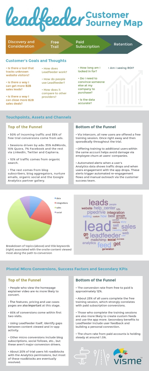
If you are struggling to compile this data, or, lack a CRM that would make researching this easier, you can always interview your customers. Ask if you could have 15-30 minutes of their time to ask them a few questions (you can even compensate them with a $10 Starbucks or Amazon gift card). Interview as many people as you can, but no need to go overboard.
Then, use this data to map out your strategy. This will help you identify the key touch points of your website or the areas your users interact with.
Throughout these touch points, you should be able to map out the emotion, thoughts, goals, pain points, and opportunities each touchpoint needs to evoke.
Answering these questions will help you direct your design. Is their imagery that will help best address these areas in the way you want? What about a particular color palette? Getting started on your customer journey map will help create answers to these questions and better reinforce your design.
2. Remove distractions and reduce friction
Certain elements on your website are going to detract from the value and message you’re trying to convey. Complicated animations, content that’s too long, and “stocky” website images are just a few examples.
With an audience that only has an attention span of eight seconds, you need to make it abundantly clear what your user will learn on the page they’re viewing and your design must not detract from this.
This starts with making sure you have consistent brand guidelines you can work off of.
This should detail your font styles, colors, imagery, iconography, and logo usage. Without this, it’s easy for brands to struggle when designing pages. You’ll likely start to see arbitrary colors and varying font styles and sizes used, which in turn, can distract from your message or create visual confusion for people trying to convert.
It’s also important to avoid too many on-page animations or interactions. If you’re scrolling through a page and see every button pulsing or a section of icons each with their own animation, it can feel overwhelming and distract them from reading what’s on the page.
Let’s take a look at the website below as an example. Note, since I’m treating this as more of a critique, I’m removing the brand’s logo from the image so they can remain more anonymous.
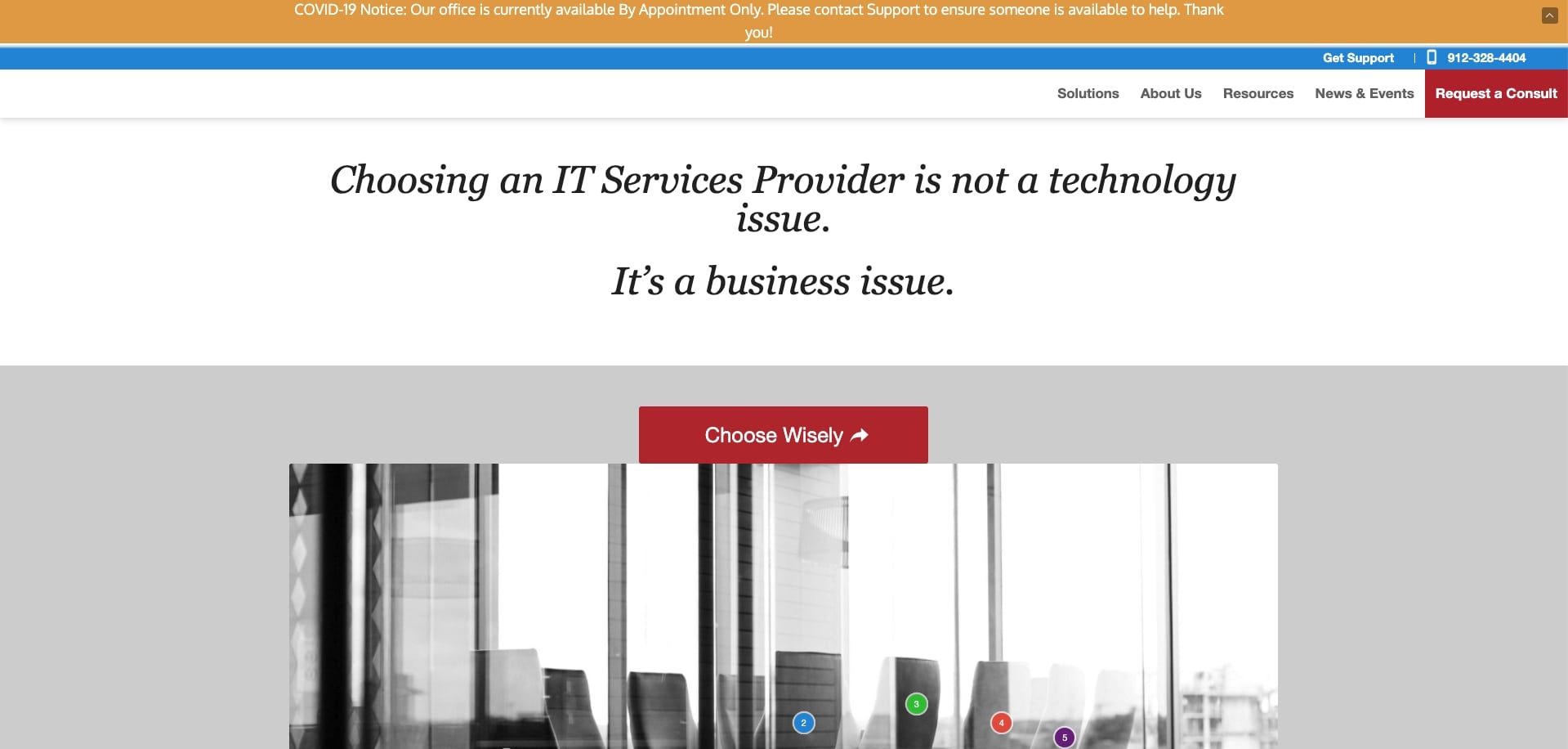
When looking at this site, the first thing I noticed was the colors.
For one thing, the way they are used makes it hard for the user to decide where their eye is supposed to go. Should it be one of the two red buttons? What about the hello bar? Or maybe the top of the navigation?
You need to figure out where you want users’ attention to go when they arrive on the page and what order it needs to flow naturally. This current color arrangement creates friction in accomplishing this.
Second, there are some areas of inconsistent spacing. The hanger in …